Settings management
Settings is an area in the product that allows users to configure how their instance should behave.
There are several areas within GitLab to manage settings:
- Admin settings
- User settings
- Project or Group settings
- Feature settings
Settings visibility and access depend on the permissions and roles users have in a particular GitLab instance, group, or project.
- User settings: Preferences that you have an ownership of as an individual user. Accessible via the top navigation, under Profile > Preferences. Example setting: Changing how the date and time are displayed.
- Group settings: Settings for group features, or settings that apply to projects within a group. Group settings are only visible to maintainers and above, and are accessed via the Settings section in the left sidebar. Example setting: Configuring an integration that all projects in the group will inherit.
- Project settings: Settings for project features. Project settings are only visible to maintainers and above, and are accessed via the Settings section in the left sidebar. Example setting: Enabling protected branches.
Usage
Placement of settings
When considering where to place a setting within the product, consider the following:
- Access: Which persona performs the JTBD related to the setting? What role or permission does that persona have?
- Flexibility and control: At what namespace level (for example, admin, group, or project) should the setting be available? Should the setting cascade down to children namespaces? Should there be a way to override a setting set at a parent namespace?
Settings inheritance
By default, settings cascade down from the parent namespace. Admin settings will thus affect groups or projects in the namespace, and group settings will affect projects in the group. However, some settings can be overridden at the group or project level, so it's important to clarify if a setting will be inherited, and whether or not it's possible to override it.
When a parent setting can be overridden, make that clear in the parent setting's UI. For example, add help text to the setting saying: "can be overridden in each project."
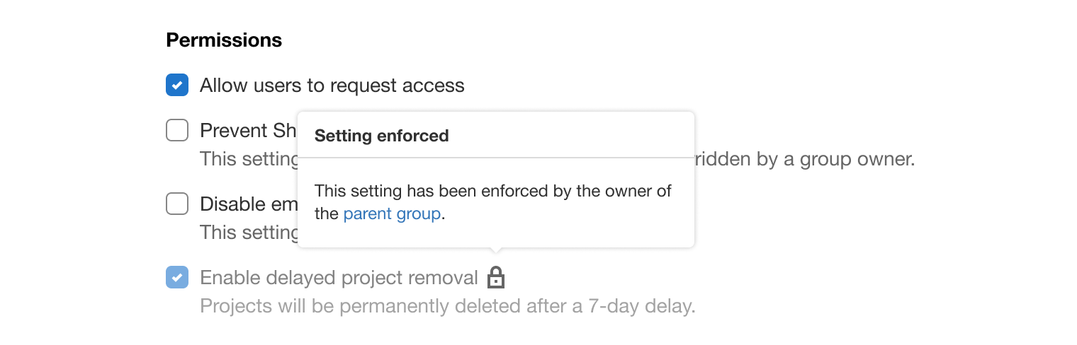
When a child setting is enforced from a parent, make this clear in the child setting's UI. For example, consider disabling the child setting and adding a lock icon with a popover to explain the nature of the restriction:
Grouping
Admin, group, project, and user settings utilize full pages to group different categories inside accordions. This is different from feature settings which live next to a specific UI element. On settings pages, the most frequently used options should be made easily available to users by not collapsing the content. Horizontal separators are placed between each category to give elements enough room to breathe.
Each category displays a title and a brief explanation of what users should expect when the the accordion is expanded. Use consistent terms and follow the voice and tone guidelines.
Configuration of settings can happen directly within the accordion or can be deferred to a secondary screen using the principles of progressive disclosure. For example, consider placing configuration options in a modal or on a linked detail page to avoid overwhelming users.
Saving settings
To keep the experience of settings consistent, avoid using a combination of manual and auto-save in form options. Learn more about saving progress.
User feedback
- Use an alert for validation messages that are not directly correlated with an input (for example, failures). These alerts utilize in-page placement when data is saved asynchronously.
- Use a toast for success messages that provide immediate confirmation of an action (for example, saving).
Linking to settings from a feature page
Consider making configuration options more discoverable to users by linking to settings from the feature page.
- Use an icon-only button with the settings icon that, when hovered, shows a tooltip with the text
Configure in settings.

- Place it at the page-level, in the top right corner of the page, below the breadcrumbs. This sets the expectation that the settings apply to the page as a whole.
- Navigate to the specific configuration section of that page in the settings area. Doing so makes the result of clicking the button predictable and prevents users from needing to navigate away from their task. For example, navigating via the Package Registry page will end up on the Settings > Packages & Registries section of settings.
Layout
- Setting form elements use the form layout sizes.
- When a settings page contains multiple sections, each section header remains sticky on scroll to provide context.
- A sticky footer containing action buttons (for example, Save and Cancel) should appear when a setting has been changed.
- Settings should appear stacked in a single column.
Design specifications
Color, spacing, dimension, and layout specific information pertaining to this component can be viewed using the following link:
Last updated at: